

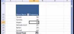
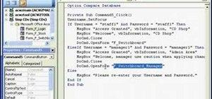
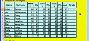
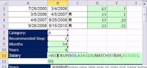
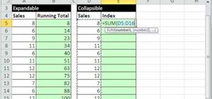
If you use Microsoft Excel on a regular basis, odds are you work with numbers. Put those numbers to work. Statistical analysis allows you to find patterns, trends and probabilities within your data. In this MS Excel tutorial from everyone's favorite Excel guru, YouTube's ExcelsFun, the 15th installment in his "Excel Statistics" series of free video lessons, you'll learn how to use create a frequency distribution, relative frequency distribution, percent frequency distribution and pie chart with a pivot table (PivotTable) and a pivot chart for categorical data.
See how to create a Pie Chart (compare the parts to the whole)
Chapter 02 Busn 210 Business and Economic Statistics and Excel Class
This is a beginning to end video series for the Business & Economics Statistics/Excel class, Busn 210 at Highline Community College taught by Michael Gel ExcelIsFun Girvin
Just updated your iPhone? You'll find new emoji, enhanced security, podcast transcripts, Apple Cash virtual numbers, and other useful features. There are even new additions hidden within Safari. Find out what's new and changed on your iPhone with the iOS 17.4 update.


Be the First to Comment
Share Your Thoughts