

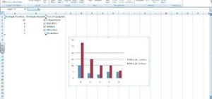
In this Software video tutorial you will learn how to make a basic bar graph in Microsoft Excel. You will also learn how to give your chart a title and how to label the axes. First you put in all your data in to an Excel spreadsheet. Then you highlight the data you want to put in your graph, select the 'insert' tab, then' column' and choose the basic column chart. Next you select the title tab, go to option and choose new title. Now you add the title to the graph. To label the axes, go on top and select the layout tab and then choose the axis title option. Select 'horizontal' and type in the name of your horizontal axis. Repeat the same for the vertical axis.
Just updated your iPhone? You'll find new emoji, enhanced security, podcast transcripts, Apple Cash virtual numbers, and other useful features. There are even new additions hidden within Safari. Find out what's new and changed on your iPhone with the iOS 17.4 update.


Be the First to Comment
Share Your Thoughts