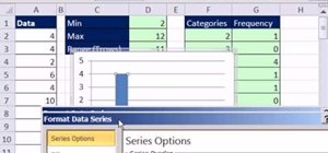
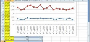
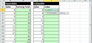
New to Microsoft Excel? Looking for a tip? How about a tip so mind-blowingly useful as to qualify as a magic trick? You're in luck. In this MS Excel tutorial from ExcelIsFun, the 636th installment in their series of digital spreadsheet magic tricks, you'll learn how to create a dynamic frequency table and histogram chart using defined name formulas for dynamic ranges that use the INDEX function. See other formulas that use the COUNTIF, IF and ROWS functions that help to make it fully dynamic. This dynamic chart and table will update anytime that new data is added to column A.
Just updated your iPhone? You'll find new emoji, enhanced security, podcast transcripts, Apple Cash virtual numbers, and other useful features. There are even new additions hidden within Safari. Find out what's new and changed on your iPhone with the iOS 17.4 update.





1 Comment
I am looking for a software tool or a way to produce in excel, and have been looking for months, for software to be able to produce a wall chart that is similar to this link:
http://en.wikipedia.org/wiki/File:United_States_Frequency_Allocations_Chart_2011_-_The_Radio_Spectrum.pdf
The different lines of course cover a wider range of frequencies so what I would like to do is to produce a chart by using each line as a different graphic and then pasting these into a graphics tool and printing the wall chart after getting all the charts lined up.
Please help in my search
I work for the US Army as a spectrum manager and want to produce a chart like this for our local area.
Thanks
Kenneth Johnson
Share Your Thoughts