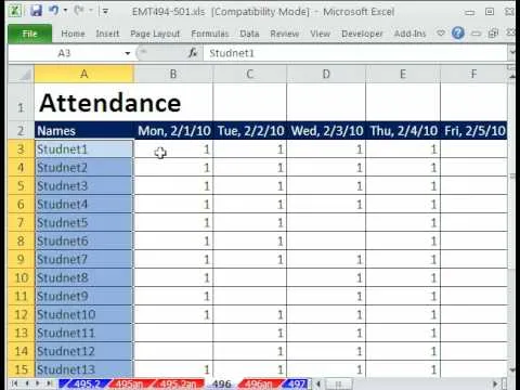
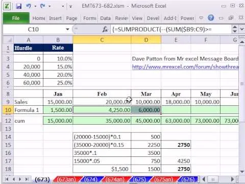
Take a look at this instructional video and learn how to analyze how a process or other area is actually performing by connecting data to the shapes in your diagram with Microsoft Visio 2007. You can also add different visual effects based on the data values. For example, you can link sales data from an Excel workbook to the shapes it relates to. When a phase of the sales process takes longer than guidelines recommend, the shape for that phase changes color or shows an icon that alerts you to the situation.
Apple's iOS 26 and iPadOS 26 updates are packed with new features, and you can try them before almost everyone else. First, check Gadget Hacks' list of supported iPhone and iPad models, then follow the step-by-step guide to install the iOS/iPadOS 26 beta — no paid developer account required.









Comments
Be the first, drop a comment!