


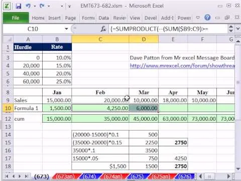
As you might guess, one of the domains in which Microsoft Excel really excels is finance math. Brush up on the stuff for your next or current job with this how-to. In this tutorial from everyone's favorite digital spreadsheet guru, YouTube's ExcelIsFun, the 50th installment in his "Excel Finance Class" series of free video lessons, you'll learn how to demonstrate the inverse relationship between bond rate and price with a scater chart.
Home
Microsoft Office How to Make an Excel scatter chart to show the relationship between bond rate & price

By getexcellent
Apple's iOS 26 and iPadOS 26 updates are packed with new features, and you can try them before almost everyone else. First, check Gadget Hacks' list of supported iPhone and iPad models, then follow the step-by-step guide to install the iOS/iPadOS 26 beta — no paid developer account required.


Comments
Be the first, drop a comment!