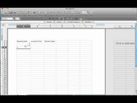
In this tutorial, we learn how to make a histogram chart in Excel. To create a vertical histogram, you will enter in data to the chart. Then, highlight all of the data and go to "insert", "chart", then choose a regular column chart. Grab a regular 2D column and then make sure your values are correct. Then, right click and go to "chart options", then take the legend off. Now, make these columns all touch each other by right clicking over the columns and formatting them. Go to "options" then change the gap width to "0". Now you have will a simple histogram chart. Do the same thing to make a horizontal chart, just click horizontal while on the first step and you're finished.
Apple's iOS 26 and iPadOS 26 updates are packed with new features, and you can try them before almost everyone else. First, check Gadget Hacks' list of supported iPhone and iPad models, then follow the step-by-step guide to install the iOS/iPadOS 26 beta — no paid developer account required.











Comments
Be the first, drop a comment!