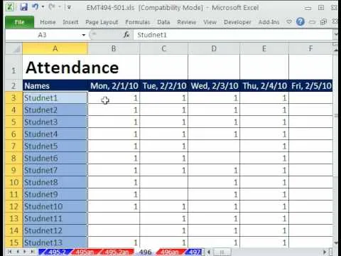
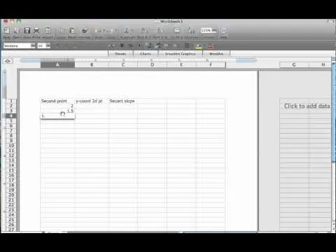
In this tutorial, we learn how to make your first graph in Microsoft Excel. First, open a new graph and enter in your data. Click and drag down from the original date you enter to have the other dates automatically entered in. Enter the rest of your information, then highlight all the data. Go to the menu and click "insert", then "chart". Now, go through the chart wizard to select what kind of chart you want to make. When you are finished entering all your preferences, change your values so they match your data and correspond correctly. When you are done, save your graph and then use this to print or save to a project.
Apple's iOS 26 and iPadOS 26 updates are packed with new features, and you can try them before almost everyone else. First, check Gadget Hacks' list of supported iPhone and iPad models, then follow the step-by-step guide to install the iOS/iPadOS 26 beta — no paid developer account required.










Comments
Be the first, drop a comment!