


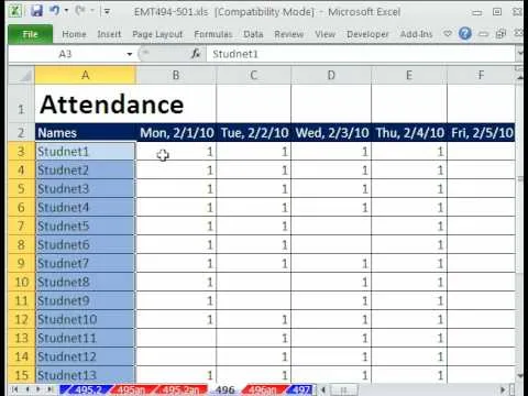
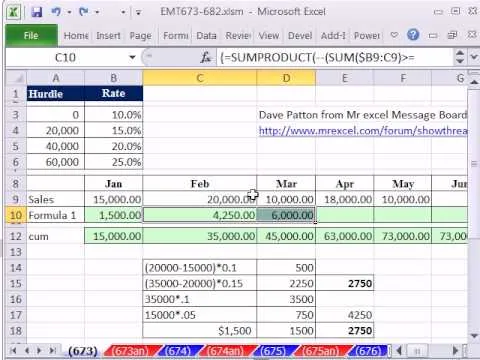
This video introduces how to use Excel to sort data, perform the Frequency function, and present data in line chart. See how to apply condition formatting when working in Microsoft Excel 2007. Whether you're new to Microsoft's popular word processing application application or a seasoned MS Office professional just looking to better acquaint yourself with the Word 2007 workflow, you're sure to be well served by this video tutorial. For more information, and to get started creating your own line charts, watch this free video guide.
Apple's iOS 26 and iPadOS 26 updates are packed with new features, and you can try them before almost everyone else. First, check Gadget Hacks' list of supported iPhone and iPad models, then follow the step-by-step guide to install the iOS/iPadOS 26 beta — no paid developer account required.


Comments
Be the first, drop a comment!