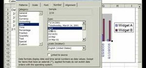
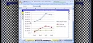
This video is about formatting the charts in Excel especially the x and y axes. The video begins by selecting a chart and right clicking the dates at the bottom of the data points. The format axis window pops up and by making changes to the style, color and the weight of lines given in the patterns tab, you can change the way the x-axis looks like. You can also change appearance of characters appearing close to the x-axis by selecting options in the font menu. You can also change the format of the y-axis by right clicking the value at the bottom of the data points.
Just updated your iPhone? You'll find new emoji, enhanced security, podcast transcripts, Apple Cash virtual numbers, and other useful features. There are even new additions hidden within Safari. Find out what's new and changed on your iPhone with the iOS 17.4 update.






Be the First to Comment
Share Your Thoughts