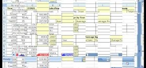
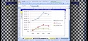
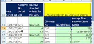
Whether you're interested in learning Microsoft Excel from the bottom up or just looking to pick up a few tips and tricks, you've come to the right place. In this tutorial from everyone's favorite digital spreadsheet guru, ExcelIsFun, the nth installment in his "Highline Excel Class" series of free video Excel lessons, you'll learn how to create and use simple charts in MS Excel as well as see how to use Excel's SUMIFS & AVERAGEIFS functions. Specifically, this video covers the following topics:
1) Difference between a Line Chart and a Scatter Diagram Chart
2) Add trendline
3) SUMIFS function
4) AVERAGEIFS FUNCTION
5) PivotTable (Pivot Table) to add with multiple criteria
Just updated your iPhone? You'll find new emoji, enhanced security, podcast transcripts, Apple Cash virtual numbers, and other useful features. There are even new additions hidden within Safari. Find out what's new and changed on your iPhone with the iOS 17.4 update.





Be the First to Comment
Share Your Thoughts